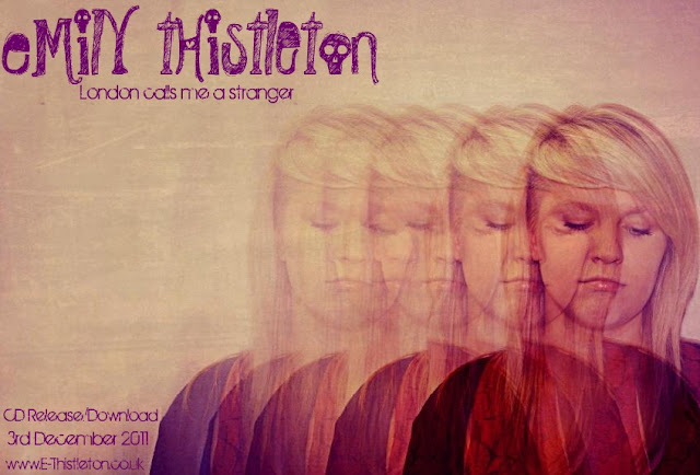
Using photo shop, Brittany has edited this photograph into an Advert design for the artist Emily Thisleton. I really like the effect she has used of repetition and fading as the images overlap eachother to create illusion to the viewer. Brittany is very skilled in photo shop due to her photography background, therefore this gives us a great advantage to creating great work, but also she has helped me learn some skills in using the programme.
We chose to use the purple writing here, as it matches the dark colours of the edited image, which makes the cover look professional and as a whole. Also we have tried to make the composition of the writing balance out with the image by putting it on the opposite side. This ensures the cover doesn't look uneven to the viewer and the whole space is used.
Below is a video we created which shows opinions of our target audience towards the advert. We had great responses, especially about the editing technique therefore this feedback has given us a hint into what an audience in the modern day wants to see and is attractive; unusual and imaginative editing.
Although I think this is a very good post using technology well I have a few concerns.
ReplyDeleteEmily Thistleton is not your artist. Really you should have created a real mock up of your artist who I think is a male right? Then your experiements with colour and so on could have been more effective. JIN