Labels

Tuesday, 20 December 2011

Q4. How did you use media technologies in the construction and research, planning and evaluation stages?

How did you use media technologies in the construction and research, planning and evaluation stages?

Below is a Jing video that we have created, with a voice over explaining what technologies we have used through the use of Blog. 

Unable to display content. Adobe Flash is required.

Technology used for Research:


Technology used for Planning:

Technology Used for Evaluation


Setting up the tripod, ready for filming
This simply shows me setting up the tripod by releasing the legs to make the shot reach the characters level. It also keeps the shot steady and prevents it from wobbling and making it look unprofessional.


EDITING SKILLS


Here I have created a short video of myself editing some music video footage. I filmed myself by using a digital camera on a tripod then edited it into a short sequence with Final cut. To an audience it is not clear what I am doing therefore I used Youtube and the tagging tool to explain what I was doing.

Q3. What have you learned from your audience feedback?


Here I have created four different edits of the same digi pack cover, however I wanted to know what my audience would want therefore as our target audience is around my age group of 18 and teenagers I decided to post the images on facebook and wait for a response. This was good as the friends I have on face book are mostly my age therefore I am specifically getting opinions from the audience I want. Now I have a good Idea of what edition I will use in the final digi pack cover.


To gain real audience feedback from the target audience of young adults and teenager, I decided to ask a few people to watch the video then give me their personal technical opinions of what they thought. they told me what they thought went well, however what I could improve on.

One of the major improvements was the green screen issue as you can still see the green outline around the character. This problem was down to the creased green sheet behind the character when we were filming which we found especially difficult to straighten out and needed some help from others in the class. However we did not realise how much this would effect our editing when we convert it to the Mac, and it obviously effects the audience when they watch it. I feel it looks unprofessional in comparison to the rest of the video with clean and steady shots, therefore we asked our school technicians for detailed help to perfect the green screen so it doesn't let down the rest of the video.

On the other hand they did recognise the parts which we thought went well including showing the male pop genre, lip syncing and using London locations to link to the lyrics and themes of the songs.


Facebook advertisement and PUBLIC anonymous Questionnaire


CLOSED AND OPEN QUESTIONS
DROP DOWN MENU
Due to the success of creating a questionnaire last year when evaluating my thriller opening, I decided to create another one to ask my target audience, of young adults, to get an idea of what they are thinking and the best and weakest points about the video and Digipack.

A SCREEN GRAB OF THE QUESTIONNAIRE
I first of all posted my music video online on my Facebook page so anyone can watch the video and write their opinion. I also supplied a link to the questionnaire for the audience to complete after watching the music video along with the posted Digipack. This allowed me to ask the audience whether they felt it all merged together into creating a Brand identity and if the digipack and CD cover advertised the feeling and meaning of the song.

I had some varied and honest feedback from the audience but overall it gave me truthful and useful information to what we can do to improve. I have created some useful charts and graphs which are clear for me to see specific data of the response I received.

RESPONSE FROM QUESTIONNAIRE 

These are the editing techniques which were suggested to use to improve the video/ Digipack:
- Black and white coloured shots to add interest and change the scenery and atmosphere slightly
- Cross fade of locations
- Smoother cuts between shots
- Slow motion
- Colour adding
- Flash effects
- Merge clips together of the separate characters in different locations and overlap them so you can see them at the same time even though they're not together
- Apply a dual narrative

Do you think the performance of the artist is good in terms of energy and expression? 

This question gave us some great responses as the majority of people enjoyed watching our artist perform however he still could have been more expressive by using a wider range of facial expressions and body language for example hand gestures and getting into character.

How engaged does the video keep you? 


The main aim of making our music video is to engage the performer throughout from start to finish and we couldn't tell this ourselves as we are the ones who have been editing it and producing it. Therefore we asked our target audience of young adults whether it kept them engaged and received a varied response with people rating as low as 5 up to a rating of 10. Even more so the majority was a rating of 8 which we feel is a great response, as people felt the performance he gave really reflected the lyrics of the song of him feeling a 'stranger' to London, through slightly enclosed body language.


Q2. How effective is the combination of your main product and ancillary texts?

How effective is the combination of your main product and ancillary texts?


We decided on a font called 'Hasteristico' which we discovered on a website called DaFont. At first both myself and Charlotte found it difficult to decide on the name of our artist, as we wanted to keep it simple but still having a coolness about it. When we decided on the name 'Frank Miller' we thought that our font should represent our artist just as much as the name did. Therefore, the font is quite plain but is still strong and fits perfectly when representing a male indie/pop artist. As you can see from our video clip, we had other idea's of using other interesting fonts, however I think that some of them could have been a bit distracting and taken away the concept and effect of our advert + digipack.

make a gif at gickr.com


I have made a gif merging the ancillary tasks including both mine and Brittany's adverts along with our digipack which we created together. It really reveals the colour scheme of orange/ yellow which portrays the theme of bright lights and the vibrant atmosphere in London. I feel this really works as it gives the artist a brand identity just like Ed Sheeran who uses the colour orange at the front of his album cover. We also decided to hide the artists face in the front cover of the album to show the importance of the music to the artist rather than his full body image to attract his audience. This is one of Ed Sheerans main characteristic and as he was one of our main influences we feel this is very important to show in the image of our artist


Even though we decided that the image of our artist wasn't as important as the music, we still done a lot of thorough research into our artists outfit, as we had to choose carefully the colours and styles that we were wearing as we wanted Frank Miller to have the 'typical London look' for a male. You could suggest that this went against the combination of our main product as the lyrics to his song are about him feeling lost and swallowed up by this new hectic lifestyle he has been brought into. Therefore, we could have styled him in more of a unique way to convey the theme of him feeling lost and lonely. However, we still wanted to keep him current and fresh, and therefore we decided to use well known brands such as Hollister, and use the colour scheme of red and white in his costumes throughout. We decided to use both these colours as not only do they contrast, but the red represents his passion for music whereas the use of the white imagery represents his innoncence and naiveity to his new lifestyle that he is trying to adapt to.


Q1. In what ways does your media product use, develop or challenge forms and conventions of real media products?


  Here is a Gif which reveals the fast motion editing from Ed Sheeran's video A Team. As you can see the character is not moving however the uneasy traffic around her is bright, vivid and maybe overwhelming for her. We have used the same effect in our video various times to emphasise how London maybe intimidating and overwhelming for people who are not used to such a busy and populated area.


View more PowerPoint from Charlotte Hannah

Thursday, 15 December 2011

Chosen Record Label

We have decided that SYCO would be our Record label for the release of our music Video. We have chosen this Label as it's a large well known company and has signed many successful artists and would be able to push our music video further into the market. It also based in London and established by Simon Cowell who is a Worldwide know agent who has years of experience and a good eye for making good pop music, therefore would be a great benefit and help to have Simon Cowell producing and releasing the video.

It also focuses on promoting it's artists through TV therefore the Music video would get a lot of coverage to audiences if it was successful.

- It links well to the chosen genre of male indie- pop
- Other Artists are Olly Murs and Mat Cardle who are also Indie- pop artists.
- It is based in London

Music Video Assessment


After a few weeks of filming, we edited about 30 seconds of footage to show to the class which allowed us to get feedback from our peers to help us with what we can do to improve. For example we used the green screen, however there is still some green that is visible which we need to tweek. Also this is more visible on a larger screen, explaining why we could not see it as easily on the Mac whilst editing.

Friday, 4 November 2011

Work in action


Here is a photo of me during the process of planning. Using Google maps I've been able to research into locations in London to ensure they are suitable before actually filming, for example Brick Lane and South bank. 

Storyboard


We have created a video with our chosen song in the background including the separate shots that we wish to use when filming. This is only a plan therefore it may change as our plans develop and more ideas arise.
It's important to follow a storyboard not only for the filming but the editing as well, for something to make reference to so you don't go off track. It is a guidance tool, and it makes the shots we wish to use clear, especially with the detail next to the shot explaining the sound, lyrics, movement of camera and character.


Location shots


For this post, we decided to use the application ANIMOTO, to create a short 30 second video of a variety of the locations we wish to use. We thought this is more visual and interesting but also its a new application of technology we haven't used before, therefore we have increased our technical knowledge in the process.

The locations we have chosen are specific to the lyrics and the meaning of the song which is London. Therefore we have chosen a variety of areas in London, which we think will be effective with the editing techniques we wish to use, for example fast motion editing in South Bank skate park.

To show the difference in atmospheres within London we want to film in both day and night time, internal and external.

Cinematography
Here is a Gif from Ed Sheeran's video A team. We really like this shot and would like to use something like it as a low angle mid shot. The Gesture really reveals the meaning of our song, and maybe how the character feels alone and wants some company or warmth from someone.


Here is another Gif from Ed Sheeran the A team, where he uses fast motion editing. We are planning to use this editing technique as it looks really effective but also links with how our character may not be used to the rush of London and how fast everything and everyone moves. It would emphasise this as our character would be standing still in the centre of all the rush.

Advert designs


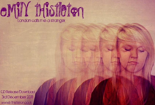
Using photo shop, Brittany has edited this photograph into an Advert design for the artist Emily Thisleton. I really like the effect she has used of repetition and fading as the images overlap eachother to create illusion to the viewer. Brittany is very skilled in photo shop due to her photography background, therefore this gives us a great advantage to creating great work, but also she has helped me learn some skills in using the programme.

We chose to use the purple writing here, as it matches the dark colours of the edited image, which makes the cover look professional and as a whole. Also we have tried to make the composition of the writing balance out with the image by putting it on the opposite side. This ensures the cover doesn't look uneven to the viewer and the whole space is used.

Below is a video we created which shows opinions of our target audience towards the advert. We had great responses, especially about the editing technique therefore this feedback has given us a hint into what an audience in the modern day wants to see and is attractive; unusual and imaginative editing.


Shooting Schedule


We have not yet confirmed dates yet therefore we have left this column blank until the planning process is complete and we can confirm the availability of our locations. 

A shooting schedule has really helped us to plan out and write down the separate locations we wish to use when filming, and what characters are going to be in these shots but also what member of the crew we need. Most of the shots will include myself in London, however Nathan will also be filmed against a green screen where after we will edit a background behind him, but also use his lip sync to fade him into some of the London shots. We really like this technique and have seen it in previous work which has worked effectively but also in professional music video. We now wish to develop our skills enough on final cut and other editing programmes to be able to make our film look the best and most professional it can. 

We also think the variety of internal and external shots is important for this video, as they can represent different emotions against the character for example outside in a congested area in London like Oxford Street,  would enhance upon the audience that the character feels intimidated and like a 'stranger' to the location and people around her; it is a new environment she is not used to. 

Location Permission letter


Only one of our locations requires permission to film in, which is the green screen within our school location. Therefore we have written an email to the school technicians which control this area of media, to ask for permission to use the equipment and some technical help to set it up. Once we have confirmation of the permission we will soon book a date to film with our main character Nathan Bedford against the green screen.  This will also require the booking of media equipment such as a tripod and various camera's to capture different shots of our character from different angles.

It is important to pre- plan and ensure permission is granted, to confirm it is OK for you to film either on someone else's property but also to maybe capture the public who maybe in the location at the same time. It also guarantee's no last minute dissapointment when you turn up at the location and you are turned away and permission is rejected. This would definitely scramble your shooting schedule therefore it is very important to do this. 

photo shoot plan


We created a photo shoot plan, in order to set out the type of photo's we wish to take and create for our production package of a Digi pack. 

We have really thought about the variety of editing techniques and camera shots we can use. For example one of the shots of our male character is to be taken with a fish eye lens, which really emphasises the emotion in the song, as it enlarges the object close to the camera, and decreases the size of the background, therefore making the character look like they're centre of attention. 

The main photo on the front of our CD cover, is to be a collage of pictures we have taken of Nathan showing different emotions, the using 

Talent release form


Nathan is an external member of the group, therefore it is even more important we have proof of his acceptance to perform and feature in our music video. He is our lead male in the video therefore he will have a lot of screen time which the audience will see. 


Even though I am a member of our group, I have completed a permission form just to portray that I am happy to feature in my video and that it can be used for educational purposes, and advertisement of our creation.

Tuesday, 1 November 2011

Track permission letter


A track permission letter, is to ensure that our group has permission from the artist or organisation to allow us to use their song for our music video, and other promotion packages. It is important to do this as otherwise it can be seen as copyright against the artist as it is not your creation to use as you wish without their consent. In the professional music world or TV, if a programme wishes to use music they'll have to also get permission from the artist. 

Lists of props, costumes, make- up and equipment


Props
Our props were kept pretty simple, as we wanted our main focus to me on the image of our artists and the location rather than the props used. However, we decided that when we film the lip syncing for our lead male role than he should an acoustic guitar to play. We thought that this prop would connote well with our pop image that we're trying to create, as many male pop artists such as Ed Sheeran, Jason Mraz and James Morrisson all incorporate an acoustic guitar in their music video's as it's effective to the portrayal of their image which is relaxed and laid back. 
Our second prop that we're going to use is a bicycle with a basket. We added the basket to our bicycle to make it more feminine, to really emphasize the vulnerableness and loneliness that this young girl in our music video is experiencing. Also, as our location is set in London, we observed how most young people travel around London, which was either by bus or by bike. However, we thought that by using a bike we would be able to capture a variety of more interesting shots in our music video and use different special effects to our advantage (like a fast motion effect.)
Costumes
As I've previously discussed in other posts, the costume choice was pretty easy for us as we wanted our target audience to relate easily to our lead female. Therefore we didn't want to over exaggerate our character or give her dramatic, over the top clothes to wear. Therefore we went with the 'typical' image of a London girl, who dresses quite funky. Topshop is extremely popular amongst young girls so we thought that if she dressed similar to the 'topshop image' then as well as being relatable to our audience they can also aspire and admire her. To be specific Charlotte would probably dress in something like a vintage cardigan, with shorts and some funky tights. What is useful as well is that Charlotte has a very popular haircut, therefore she would be more of a fashion icon.
Our males style is going to be pretty similar, as we want to be relatable to our male audience. Like Topshop, Topman is also extremely popular amongst young boys and especially for some pop artists like Olly Murs, JLS and One Direction. It is important to remain within the stereotype of our chosen genre, and make aspects of this really obvious. Nathan would most likely to be wearing something like chinos, boat shoes and maybe a hoody. 
Make-up
Make-up was something that we were undecided about for quite some time. We couldn't decide whether we wanted to have her natural or to have her made up. We then decided that maybe we should use both for different shots. She could be made up when she's searching the streets of London, as if she is trying to make something of herself and to emphasize the glamour. However, we could do her make up naturally when we're trying to convey her loneliness, as if she's been stripped of all her confidence and ego and this is how she really feels in London (which is lonely and sad.)
Equipment
It didn't take us long to decide on the equipment that we would need for our music video. As I also do Photography for A-Level I already have my own Nikon camera that films in HD. This is an advantage for me and Charlotte as I am always using my camera and have previous experience in filming with it. It will also improve the quality of our shots and develop our music video to be more successful as framing is a key element. We will also need to rent out a tri-pod from school, as we will need it for tracking shots and high angle shots etc. This will also make our shots more steady, because if it is shaky it might  detract from what's in our shot. We will also be using the green screen for a few of our shots, which we will also have to book, as well as a technician to help us set up. I am most looking forward to using the green screen as I like challenging myself as I am not that confident with using it. Lastly, we will also be booking out the lighting to take with us to London, as the lighting is crucial to convey the emotion within our music video and therefore we have to consider when high or low key lighting would be useful.


We thought of an idea to writ the lyrics on card which we will stick on with blue tack onto a cardboard sign that we would make ourself. This is just to vary the shots and add interest into them with different content within them. We will use this at the beginning of the video, as we have decided to change the name of the song to London Calls Me A Stranger, instead of The City as this is a key lyric within the song and fits our genre. A most of our footage will be filmed in London our location and setting already relates to our title and lyrics. Our original idea was to write the whole lyrics onto one piece of card however we discovered an old music video which altered our idea and inspired us. 

This is a music video by Bob Dylan called Subterranean Homesick Blues. From this we decided our lyrics should be written word by word on 5 separate pieces of card which Nathan can then drop one by one as the lyrics peel off . We think this is a really good way to enhance the lyrics without just lip syncing them and to add interest into the shots. Also I really like taking inspiration from other video's which are original and use simple ideas which are effective. We may have to use fast motion editing as we want this at the beginning of the song before the lyrics come in which is only a duration of around 10 seconds. I also like the atmosphere and feel Bob Dylan gives off as  relaxed and chilled, which is what we want Nathan to look like. Therefore we will show Nathan this video as a model to get inspiration from in terms of body language, facial expressions and posture to create this image. 

Tuesday, 18 October 2011

BRAND INDENTITY

Digipack Ideas
Here we really like the overlapping and layers of font, colour and shapes. We are interested to immitate this editing technique as one of our images for our digipack, however using the lyrics as the letters and words overlapping, and maybe putting a faded image of the main character over the top. 


Both myself and Brittany came up with the idea to use for our Digi pack which would involve us developing our skills in photo shop. A really impressive photo that we have taken of our main location London, will be edited so the colour contrast will stand out and relate to our genre. We then came up with the idea to take a series of images of Nathan and portray then like a mini photo shoot. We would then edit these so that it will reflect our genre and highlight the emotion we wish to show.
Finally we came up with the idea to print our series of images onto elletrocet, so that when we overlap these images onto our location photo our pictures of our lead male will look as if they're faded, as if he is being consumed by London like in the narrative of our song.


Font types

Through the website of Dafont, we researched into different types of font to use for our Digi pack and CD cover, and here were our favourites due to the modern and edgy look they portray. 


The font above is our most preferred font as it's strong however not bold. It is really simple, but we are attracted to this as it's modern and not too detailed to attract too much attention away from the image which will be on the cover.


Font ideas

Sunday, 16 October 2011

Planning posts - checking your progress Oct 16th SJA

www:
  • The planning posts that are there show imaginative efforts with ICT to present and communicate ideas.
  • The use of short iMovie to communicate your 'initial ideas' is really effective
  • I thought your practice CD cover on photoshop looked really good - you selected an excellent photograph that seemed really suited to the idea of 'artist' and similiar representations in this genre. The font choice also worked really well with the simplicity of your image, as did the sepia effect. Nice work on this.

ebi:
  • There are several planning posts that need to be improved still Charlotte. Your post on 'roles' needs more information to explain your role and Brittany's role. You obviously need to come back to the post on 'Technical tutorials' - and upload your greeenscreen / final cut work to this. You currently just have a few photos for this post - I'm sure you will come back to this and provide written or recorded verbal information...
  • Lyrics annotation is OK... but needs more detail about locations / performance / narrative / what you plan to film / show the audience for each verse / line?
  • Where is your photoshop work for the advert planning / ideas? This needs to be there. You also need to provide written explanation about your ideas / thinking behind the image of jade you used for the CD cover design practice task. Please don't just upload an image without any explanation Charlotte.
Planning progress so far: GD (Good) and IN (Improvement Needed) - you know you will have to come back to the posts you have completed for Planning so far and develop them further. To reach the top of Level 4 (required for your 'A') you really need to show creativity, innovation, imagination and ICT technical flair for every post. The 'Planning' section of your blog really should provide you with loads of opportunities to demonstrate all of these things.

Friday, 14 October 2011

Concept


Here we have created a video showing all of our cut out images of the props costumes and locations we wish to use. We thought this was a more visual way of reflecting our ideas and it also has laid it out clearer for us to see. 

Cinematography
We have planned to integrate the editing techniques which are popular and common within Ed Sheeran's other videos which is especially fast motion editing. 
 Here is also a Gif showing fast motion editing used in Ed Sheeran's video, which we think is really effective. We are not planning on making our character homeless however they will be revealed as a lost individual in London and someone who is not used to the surroundings.


We also are planning to take close up shots of Nathan lip syncing as he is our main character who is lyrically telling us how he feels, therefore his facial expressions and showing him singing the lyrcis is very important to reveal our idea. We will also have another character who is visually revealing how they feel in the location of London and in different settings.
Costume


Here I have created mood boards of the type of costumes and clothes we are aiming for in our music video for both characters. They are both very fashionable however quite edgy and have an indie and modern feel to them. They are also quite similar with the mix and match look of different colours, textures and patterns. This really represents Ed Sheeran's type of music which represents a mixture of meanings that are very modern in this world and associate with the people around us. He is also very individual himself, therefore its important to portray this through the characters look in our video and costume is the most obvious way as this is what the audience automatically looks at. 
I think the costumes of the men below are quite countrified through the wooly jumpers, maroon and other earthy colours and the wooly hats. This really suits the lyrics for example one line is 'London calls me a stranger', which could emphasise Sheeran's separation from London as he is not originally from there. Also the song may relate to when Sheeran moved to London to promote his music and advance in the industry. 


Location


We have taken these images from Embankment skate park, as this is one of our ideas for a location in our video. We also want to use an editing technique of Fast Motion editing, by using the public skaters and our female character. The female character will be in normal time, however the skaters will be in fast motion. This really emphasises that line of 'Stranger' as this character is not the same as everyone else and could emphasise that the speed and energy of the city is different to what she's used to...linking to how Sheeran feels. 
So for example, our female character could be sitting on this platform watching the skaters, which are in fast motion speeding past her, which is quite deluding. This would also reveal our use of technology and creativity being used to create our music video. 

Technical Tutorials

Camera Techniques


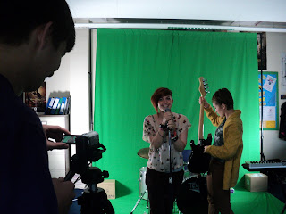
We also experimented with the use of instruments including the drums, guitar, keyboard and microphone. Each instrument requires some practice and familiarisation to get the realistic look of you actually playing the instrument. I found this quite difficult as I do not play an instrument, however Nathan looked quite comfortable and adapted to this task well.
This image shows that we found that using three different cameras at the same time allows us to film three different shots of each member of the band, saving time and effort. This meant we only had to film once through, in comparison to if we were using one camera, we would have had to film three times. We will take this experience and use it during our actual filming for our music video. This way we have footage of many different angles which will vary the shots when editing and putting the clips together.
Here is Brittany and I, during our green screen shoot involving the class and our individual groups. We got to experiement with the camera's and also when infront of the camera we used instruments to make it look more realistic. It was quite hard to feel relaxed as the class were watching us perform... however it has given me more confidence in looking into the camera and making eye contact with the audience. I found that singing the lyrics with meaning really makes an effect on the overall image of the video, as it looks as if you are emotional about this song and it relates to you.

What makes a good PUBLICITY PHOTO?


After filming we had a variety of shots to play with which we created a short video with. We have decided to leave the green screen as a background so we weren't pressured to create a similar look in the real video as we have not yet decided what we would like. However we did experiment with some backgrounds and have learned how to change it in final cut. I really felt this has given us a head start for when we create our actual video, as final cut will be the programme we will be using. I have familiarised myself with the shortcut keys to ensure a quicker edit but also how to insert or convert files into the correct format, which will really importantly save us valuable time when editing our real music video.

This green screen shoot has allowed us to reflect on our performance and how we look in front of the camera so we can decide on what went well and what could be improved. I can see that I need to find some confidence when acting in front of the camera, however my lip syncing is at a good standard.

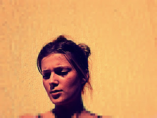
This makes a really good publicity photo as even though its simple, the effects are detailed and skill full. It also helps when the model is photogenic and looks good in a picture. The facial expression she is revealing really makes the audience ask what is she looking at and why does she have this concerned look on her face. This would most likely be answered in the songs in her album or the lyrics in that particular single. Therefore it's important to link the image on the cover or digi-pack to the songs so there is some sort of relevance in the overall package and is helpful to attract the buyer to purchase this item.