Labels

Tuesday, 18 October 2011

BRAND INDENTITY

Digipack Ideas
Here we really like the overlapping and layers of font, colour and shapes. We are interested to immitate this editing technique as one of our images for our digipack, however using the lyrics as the letters and words overlapping, and maybe putting a faded image of the main character over the top. 


Both myself and Brittany came up with the idea to use for our Digi pack which would involve us developing our skills in photo shop. A really impressive photo that we have taken of our main location London, will be edited so the colour contrast will stand out and relate to our genre. We then came up with the idea to take a series of images of Nathan and portray then like a mini photo shoot. We would then edit these so that it will reflect our genre and highlight the emotion we wish to show.
Finally we came up with the idea to print our series of images onto elletrocet, so that when we overlap these images onto our location photo our pictures of our lead male will look as if they're faded, as if he is being consumed by London like in the narrative of our song.


Font types

Through the website of Dafont, we researched into different types of font to use for our Digi pack and CD cover, and here were our favourites due to the modern and edgy look they portray. 


The font above is our most preferred font as it's strong however not bold. It is really simple, but we are attracted to this as it's modern and not too detailed to attract too much attention away from the image which will be on the cover.


Font ideas

Sunday, 16 October 2011

Planning posts - checking your progress Oct 16th SJA

www:
  • The planning posts that are there show imaginative efforts with ICT to present and communicate ideas.
  • The use of short iMovie to communicate your 'initial ideas' is really effective
  • I thought your practice CD cover on photoshop looked really good - you selected an excellent photograph that seemed really suited to the idea of 'artist' and similiar representations in this genre. The font choice also worked really well with the simplicity of your image, as did the sepia effect. Nice work on this.

ebi:
  • There are several planning posts that need to be improved still Charlotte. Your post on 'roles' needs more information to explain your role and Brittany's role. You obviously need to come back to the post on 'Technical tutorials' - and upload your greeenscreen / final cut work to this. You currently just have a few photos for this post - I'm sure you will come back to this and provide written or recorded verbal information...
  • Lyrics annotation is OK... but needs more detail about locations / performance / narrative / what you plan to film / show the audience for each verse / line?
  • Where is your photoshop work for the advert planning / ideas? This needs to be there. You also need to provide written explanation about your ideas / thinking behind the image of jade you used for the CD cover design practice task. Please don't just upload an image without any explanation Charlotte.
Planning progress so far: GD (Good) and IN (Improvement Needed) - you know you will have to come back to the posts you have completed for Planning so far and develop them further. To reach the top of Level 4 (required for your 'A') you really need to show creativity, innovation, imagination and ICT technical flair for every post. The 'Planning' section of your blog really should provide you with loads of opportunities to demonstrate all of these things.

Friday, 14 October 2011

Concept


Here we have created a video showing all of our cut out images of the props costumes and locations we wish to use. We thought this was a more visual way of reflecting our ideas and it also has laid it out clearer for us to see. 

Cinematography
We have planned to integrate the editing techniques which are popular and common within Ed Sheeran's other videos which is especially fast motion editing. 
 Here is also a Gif showing fast motion editing used in Ed Sheeran's video, which we think is really effective. We are not planning on making our character homeless however they will be revealed as a lost individual in London and someone who is not used to the surroundings.


We also are planning to take close up shots of Nathan lip syncing as he is our main character who is lyrically telling us how he feels, therefore his facial expressions and showing him singing the lyrcis is very important to reveal our idea. We will also have another character who is visually revealing how they feel in the location of London and in different settings.
Costume


Here I have created mood boards of the type of costumes and clothes we are aiming for in our music video for both characters. They are both very fashionable however quite edgy and have an indie and modern feel to them. They are also quite similar with the mix and match look of different colours, textures and patterns. This really represents Ed Sheeran's type of music which represents a mixture of meanings that are very modern in this world and associate with the people around us. He is also very individual himself, therefore its important to portray this through the characters look in our video and costume is the most obvious way as this is what the audience automatically looks at. 
I think the costumes of the men below are quite countrified through the wooly jumpers, maroon and other earthy colours and the wooly hats. This really suits the lyrics for example one line is 'London calls me a stranger', which could emphasise Sheeran's separation from London as he is not originally from there. Also the song may relate to when Sheeran moved to London to promote his music and advance in the industry. 


Location


We have taken these images from Embankment skate park, as this is one of our ideas for a location in our video. We also want to use an editing technique of Fast Motion editing, by using the public skaters and our female character. The female character will be in normal time, however the skaters will be in fast motion. This really emphasises that line of 'Stranger' as this character is not the same as everyone else and could emphasise that the speed and energy of the city is different to what she's used to...linking to how Sheeran feels. 
So for example, our female character could be sitting on this platform watching the skaters, which are in fast motion speeding past her, which is quite deluding. This would also reveal our use of technology and creativity being used to create our music video. 

Technical Tutorials

Camera Techniques


We also experimented with the use of instruments including the drums, guitar, keyboard and microphone. Each instrument requires some practice and familiarisation to get the realistic look of you actually playing the instrument. I found this quite difficult as I do not play an instrument, however Nathan looked quite comfortable and adapted to this task well.
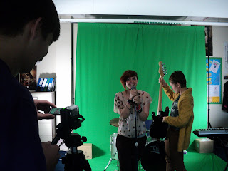
This image shows that we found that using three different cameras at the same time allows us to film three different shots of each member of the band, saving time and effort. This meant we only had to film once through, in comparison to if we were using one camera, we would have had to film three times. We will take this experience and use it during our actual filming for our music video. This way we have footage of many different angles which will vary the shots when editing and putting the clips together.
Here is Brittany and I, during our green screen shoot involving the class and our individual groups. We got to experiement with the camera's and also when infront of the camera we used instruments to make it look more realistic. It was quite hard to feel relaxed as the class were watching us perform... however it has given me more confidence in looking into the camera and making eye contact with the audience. I found that singing the lyrics with meaning really makes an effect on the overall image of the video, as it looks as if you are emotional about this song and it relates to you.

What makes a good PUBLICITY PHOTO?


After filming we had a variety of shots to play with which we created a short video with. We have decided to leave the green screen as a background so we weren't pressured to create a similar look in the real video as we have not yet decided what we would like. However we did experiment with some backgrounds and have learned how to change it in final cut. I really felt this has given us a head start for when we create our actual video, as final cut will be the programme we will be using. I have familiarised myself with the shortcut keys to ensure a quicker edit but also how to insert or convert files into the correct format, which will really importantly save us valuable time when editing our real music video.

This green screen shoot has allowed us to reflect on our performance and how we look in front of the camera so we can decide on what went well and what could be improved. I can see that I need to find some confidence when acting in front of the camera, however my lip syncing is at a good standard.

This makes a really good publicity photo as even though its simple, the effects are detailed and skill full. It also helps when the model is photogenic and looks good in a picture. The facial expression she is revealing really makes the audience ask what is she looking at and why does she have this concerned look on her face. This would most likely be answered in the songs in her album or the lyrics in that particular single. Therefore it's important to link the image on the cover or digi-pack to the songs so there is some sort of relevance in the overall package and is helpful to attract the buyer to purchase this item.


CD COVER DESIGN

Frank Miller- London calls me a stranger 
Here I have used photoshop to create a draft CD cover of our artist Nathan Bedford against a plain background holding a hooded gesture. We have decided to get Nathan to do this position as it's quite enclosed and private which relates to the title, 'London calls me a stranger'. The character looks very lonely and unhappy due to his facial expression looking down at the floor revealing a loss of confidence in comparison to if he was smiling and making eye contact with the viewer. I have edited the picture into a black and white colour scheme to contradict the stereotype of London being colourful and exciting, because this characters lyrics reveal his segregation and separation he feels.  

Jade Emans
This is one of our favourite CD covers due to the editing techniques and the main talent herself in the photo. As she is photogenic already, this adds a touch of professionalism and class as her make- up and overall appearance looks planned and well thought out. It could be debated whether it is a glamourous picture, due to her natural beauty however it has a very plain colour scheme and not much detail in the image. It is plainly about her facial expression rather than other props and elements around her which create the image, which is a really gentle and calming approach to the viewer as they can simply concentrate on the character.
The blurred editing technique at the bottom draws your eye towards her face even more as it has distorted and blurred her shoulders, emphasising her facial expression even more. 
Millie Pennington
This is also a similar situation as her face is the main focus in this CD cover. On the other hand she has eye contact with the audience with her black piercing eyes which has quite an impact and makes you feel quite dominated. This editing of her eyes has really enhanced the effect as they're harsh and bold in contrast to her natural pale blue coloured eyes which would have a more calming and attractive effect rather than piercing the audience. I also really like her body language with her finger on her lip which is just off looking like a 'shh' gesture. Its more of an edgy look with her purple nail varnish linking to her black eyes. I really like this cover, as the close up and editing techniques to make a strong contrast has quite a big impact upon the audience and creates a relationship with the model, wanting to know more about her as the gesture leaves us a bit of a cliff hanger. Maybe this could enhance that her music and lyrics will explain this.


Emily
This is a contrasting cover to the previous we have seen. It is more technological and structured. This has definately been thought about by the editor, and has used the same picture from the previous cover however this reveals a different way of editing and the skills we have. I like how the name has covered the eyes in the middle of the image as it enhances her facial expression even further. This is because you look at the name and cannot see her eyes, so you look at the other images around her where it reveals her focus which is down, making the audience think why she is doing this. The repetitive and overlapping editing technique keeps the audience looking at the image and really drilling it into them. It can also look quite delerious as it is placed at different angles which could look quite confusing. Overall I would be keen to use this editing technique as its modern and fresh and reflects the technological advancement we have.

Wednesday, 12 October 2011

Lyrics Annotation


[Verse]
The shop across the road, Here we could have a shot of a shop in london where the female character is standing
It fills my needs and keeps me company,
When I need it, The shop is like his comfort object, the shop would have to look approachable and welcoming
Voices beat through my walls, When editing, a shot of a wall could look as if it had a pulse, or as if something was passing through it.
I don't think I'm gonna make it, Body language could look quite negative, and discomforting, like head down in hands and slouching.
Past to-mor-roow.,

London calls me a stranger, He needs to look different from others around him as if he doesnt fit in.
A traveller Ohoohohh, He is never often settled in a home, so should look quite comfortable moving around in the town
This is now my home, He can now look comfortable, get a shot of somewhere which looks homely and welcoming
My home,
Oh Woah,
Burning on the back street, 
Oh Woah,
Stuck here, sitting in the back seat,
Oh Woah,
And I'm blazing on the street,
What I do isn't upto you, 
And if the city never sleeps then that makes two.,

Song Details


We have chosen to use the song 'The City' by Ed Sheeran. This song does not yet have a music video to match it, so we can really think openly about what we want our video to reveal, without referring to the original. Also Ed Sheeran is very modern and original, but also he sings about modern society issues, events or locations, for example in this song 'The City' is his main focus where he expresses how its alive and 'never sleeps'.
The GENRE of this song is male indie/pop. This artist is enjoyed by a wide variety of audiences however the target audience is mainly teenagers and young adults, due to the edgy and new feel of beats and rhythms he creates. We therefore chose to do this genre as we can link it to our taste of music, and what the audience wants to see, as this is our favourite genre of music.  

Roles

In our video as it is a song by a male solo artist, we will be using a young male and one other female character.
Our male character is Nathan Bedford who we think will suit the genre and style of the genre, due to his edgy and indie look. He is also excellent in front of the camera, as he looks natural and can make good eye contact with the camera to create a relationship with the audience. He's also good at lip syncing so can really help to make to video look professional and realistic. We know this as he has proved his talent in previous media tasks, like the green screen task, our lip synching experimental task, but also the thriller opening we created last year in year 13.
This is me- Charlotte Hannah. I will be playing the role of part producer and part actor. I will be filming some shots of our main actor Nathan, however I will also be in the music video, playing a london girl living her life. I feel I will be good as a character in the music video as I am quite confident infront of the camera, I feel like I will fit the role and I can put alot of energy and though into it, but also I have a good eye for filming a good shot so I am looking forward to help produce the video. Also I feel like I've had enough experience in media to make the shots look professional and of a high standard.

Brittany Devine will be playing the role of director, producer and the overall organiser of the camera and set. Brittany has a great imagination and also has a lot of experience within this area of camera's due to her photography and art courses she is presently taking. This gives us a great advantage as she has knowledege in editing techniques but also how to communicate ideas with the audience in a less subtle way thats not plainly obvious.  This is good as it gives the audience something to think about and gives the video a twist.


Tuesday, 11 October 2011

Initial Details


Our Initial Ideas, consist of what we have though of as a group of what we think will work well in our music video. Considering the pop genre and male artist we have chosen our ideas link to this and have been combined together from inspiration of other artists in this genre. For example the casual clothing is seen in Olly Murs video's to create quite a relaxed feel to the image of the video.
Instead of just writing a list of our initial ideas, we chose to create a short video of our ideas, and examples to match a few of them either in pictures or short clips.
Here is also a picture of our initial ideas, as it is quite hard to read all of them due to the small writing.

Final Assessment 'RESEARCH' Oct 11th SJA

WWW:
  • Charlotte, you have obviously been working hard on your blog to get through the 'Research' posts. There is some really good work here. You show evidence of really thinking carefully about artisit representation, and your analytical posts reveal a strong grasp of media terminology, and careful consideration of ideas you could use in your own music video.
  • Your 'Record Label' research was excellent, as was your extra work to create JING posts to explain some Low Budget Videos. This level of technical skills / effort and creativity in presentation will ear you higher marks.
  • I was pleased that you responded to some teacher feedback and improved your post for the Mood Board.
EBI (for the 'Planning' and 'Evaluation' sections now):
  • Time management - this is something you really need to work on Charlotte as you move through Year 13 now. Brittany will be needing you to attend all lessons (especially when filming and editing begin) and to make sure you do your contributions to making really brilliant posts - there is some inconsistency with the quality of some of your posts Charlotte. You can't produce your best work when it is left to the very last minute. I am concerned that I could only see ONE post for 'Theories' for the final mark of 'Research'??? 'Time Management' is actually one of the assessment criteria - so you need to keep this in mind throughout the rest of your work on this.
  • Make sure you are trying to really push the blog to its full creative potential - this will be the difference between Level 3 and Level 4 blogs. Think of ways (and make the time) to come up with really creative ideas for the presentation of your work. JING is great to explain any editing that you do, and to talk through the more technical posts. You could also use Youtube functions such as tagging, or do a voice over commentary for a few posts. Keep it visual and original.
Overall mark for 'RESEARCH'High Level 3/ Low Level 4 - this could so easily be bumped up to a secure Level 4 Charlotte if you invested a brilliant effort for 'Planning' posts. You just need to invest every effort in ducumenting all shot lists, costumes / props / storyboards, etc. The main thing to focus on is creativity in presentation and skilled use of ICT for every blog post.

Thursday, 6 October 2011

Theories 3- Carol Vernallis


Multiplicity shots of incomplete, obsure parts of a narrative are used.
The order of the shots is unconventional and shifts variablly with no shot order.
Time, space, character and narrative are revealed incompletely.
Discontinuity is used.
Visual Hooks are used.

THE Phantasmagorical Body 
Shots of the body will be put together in a certain way in order to encourage and reveal this 'perfect body' to the audience. In a few of the GIFS I have found below, it reveals this way of presenting a body and it is specifically seen it the female gender rather than men, however male's are sometimes seen as this image to attract the female audience or anyone who is attracted to them and like their music.


Theories 2- Andrew Goodwin


Andrew Goodwin produced a book called ‘Dancing in the Distraction Factory’ where he stated that the editing style is focused on three areas:

- Illustration
- Amplification

- Disjuncture
But it’s further split into the areas of looking at the lyrics, music and image of a band or artist.

Illustration

Music – The shots always cut on the beat.
Lyrics – The images illustrate the literal meaning or feeling of the lyrics, mainly  just with the band singing and dancing.
Band Image - The band simply singing/dancing/playing instruments, usually dressed as would be expected to the genre.

Above is a Gif of One Direction, who are dresses casually and in their video's the shots are always cut on the beat, and also their lyrics match visually with what is in the video.


Amplification

Music – Shots cut on and off the beat, to emphasise certain features.
Lyrics – The images amplify the lyrics & create a specific narrative, could be used as certain things aren’t picked up from just reading the lyrics. 
Band Image – The band could take on fictional roles in the narrative.

In Katy Perry's video of E.T she takes on a fictional role as an alien, however still a Phantasmagorical body is still revealed here to attract the target audience. 


Disjuncture

Music – Shots cut off the beat, can be a sign of a badly made music video, (but not always).
Lyrics – The images don’t relate to the lyrics that are used, sometimes used by bands who are already very well established, and who can afford to take the risk.
Band Image – The band/artist takes on an image that’s completely opposite of their expected image, e.g. Ed Sheeran ‘you need me.’

Above is a Gif from Ed Sheeran's music video called Lego House, which uses another character throughout the video to express his love for Ed, then finally at the end they meet in this form, making him happy. This is a very different approach to the video to not actually have the main singer starring in the video. Sheeran does this in many other videos for example You need me, where he uses another person to act out the whole song in sign language. 

Task 9- Theories 1...Bordwell and Thompsons


Graphic

The transitions between each shot can be linked though the same 'pictorial qualities' like shape, patterns and movement of light and can also cause abrupt cuts when contrasting qualities are used.

Graphic Match
This cut emphasizes between the graphic and the similarities of the shots.

Graphic Continuity:
This is used when the director wants to establish a sense of continuity and often narrative in a music video.

Graphic Discontinuity 
This is use when contrasting colours and shapes are used in a shot.

Spatial
This transition is used to relate each shot to one another through it's setting and location.

Continuity Editing
An establishing shot followed by a range of small range shots are shown to be in the same location and time frame.

Kuleshoveffect
There is no establishing shot but the audience assume that it is the same time and location.

Cross Cutting
This when seperature places are being shown parrallel to eachother, this usually shows what is happening in different locations during the same time in the frame.

Temportal
This is when the of action is manipulated. It is usually done through flashbacks and flashforwards, and can be used to create or answer questions within the narrative. Ellipsis in time are often used to remove boring clips that would create viewer fatigue. 

Empty Frames
This shows the figure of interest moving of the frame followed by them walking into an empty frame usually in a different location. 

Cutaway
This shot shows an event happening for a short amount of time somewhere else.

Rhythmic
This is the duration of each shot in relation to the beat or tempo. It can create tension when the length is steadily increasing and exciting when it is becoming shorter. When a shot is cut on the beat it creates a smooth flow and when it is cut off the beat it usually feels abrupt and imcomplete.


Wednesday, 5 October 2011

Questionnaire


Here I have screen grabbed the Questionnaire we have created from the website Survey Monkey. This is a great website and piece of technology which allows you the create the questionnaire to how you want it, by providing a range of question types from open and closed with text box's and tick boxes. This is good in a questionnaire as it allows you to recieve a range of answers and get a more in depth answer like their opinions and what they would recomend etc. We have created 10 questions which will recieve answers that will help us with our video, and allow us to analyse the results and make decisions from there.


Tuesday, 4 October 2011

Assessment 'RESEARCH' SJA Oct 3rd

WWW
- Charlotte, I have thoroughly enjoyed looking over your blog and reading your posts. You are clearly investing much more time in your blog of recent weeks, and you are really starting to show what you are capable of - please keep up the time investment Charlotte!
- Many of your posts are very good to absolutely excellent, I really like to overall 'visual look' of your blog, there's lots of technical skill shown in that things are moving, you have gone to the effort of creating your JING video of the Low Budget video. I'm so pleased you took up this idea - and if you have any more time to go back to some of your POP or ROCK analytical posts to do something similar, it will be very worthwhile.
- Post 14 - Genre research - 5 music videos is very good - I was so pleased to finally read a blog with all 5 there. Perhaps go back and improve a couple of the entries (as some are a little vague compared to others)
-Post 15 is really visual - looks great


EBI
- Posts 9-11 - Theories - missing??
- Post 13 - Mood board is good- needs a paragraph included underneath where you explain how / why the artists you have shown represent themselves in this way
- Post 17 - Record Label reserach - great so far, but one more needed
- Post 18 - Advert research - Great so far, but one more advert needed
- Post 19 - Scan / screen grab your actual questionnaire
- Post 20 - Really great graphs - I'm so pleased Survey Monkey was a success for you - but you do need to include a paragraph basically for each one explaining how you will use this information in the shaping of your own music video to appeal to your target audience

Overall effort - VG (Very Good)... but still has to be 'IN' IMPROVEMENT NEEDED  Charlotte, as there's work that needed to be complete by today. I will really look forward to hopefully being able to give your RESEACRH section an 'Excellent' when all posts are complete and to a brilliant standard as I'm seeing in many.  Please make sure you have all Research posts completed by this Friday Oct 7th for Final assessment.
Thank you for investing effort into your blog, again, I have really enjoyed reading through your work so far. Friday it the absolute final deadline Charlotte.